htm@portfolio:~$ cat maplemoon
05 / 19
MapleMoon
MapleMoon
Eleven flavours that needed to live on a Coles shelf without screaming at each other.
Jump to artboardsChallenge
MapleMoon was a boutique health-food brand sold in plain brown bags with stickers. The task was a full identity, packaging suite, and tradeshow presence, premium enough to sit alongside established health-food competitors.
Artboards · selected work
MapleMoon01 / 07
01
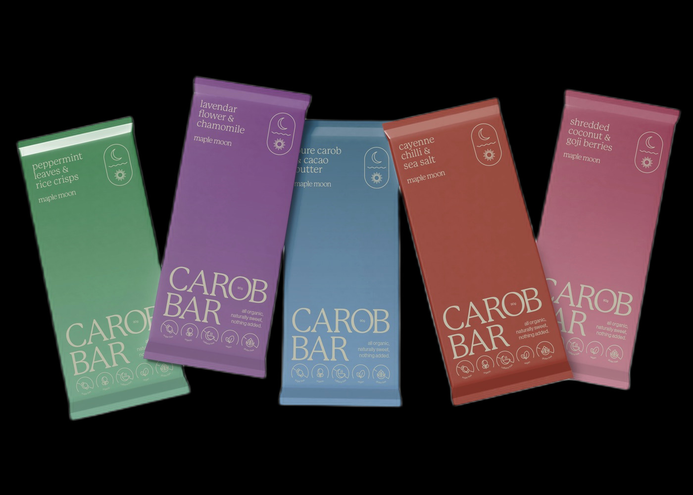
Carob Bar lineup · five flavours
01 / 07
Deliverables · index
We love the carob elixir boxes and can not wait to get them out. Thank you so much for your lovely input into our brand and business, we are super grateful for how it has turned out.