CASE FILE :: 19/19
htm@portfolio:~$ cat verde
19 / 19
Verde + Remedy

Verde + Remedy

Consumer hemp-wellness brand for Verde + Remedy, with the warmth and craft of a herbalist shop, not the clinical green of a medical-cannabis SKU.

Hand-drawn pulls the brand out of the chemist aisle and onto the apothecary shelf, even if the molecule is the same.

Year2023SectorWellnessRoleBrand + Packaging + Editorial
Jump to artboards

Challenge

Verde + Remedy needed a consumer hemp-wellness brand with the warmth and craft of a herbalist shop, not the clinical green of a medical-cannabis SKU, with the same product depth (oils, balms, lip balm) the category demands.

Artboards · selected work

Verde + Remedy01 / 10
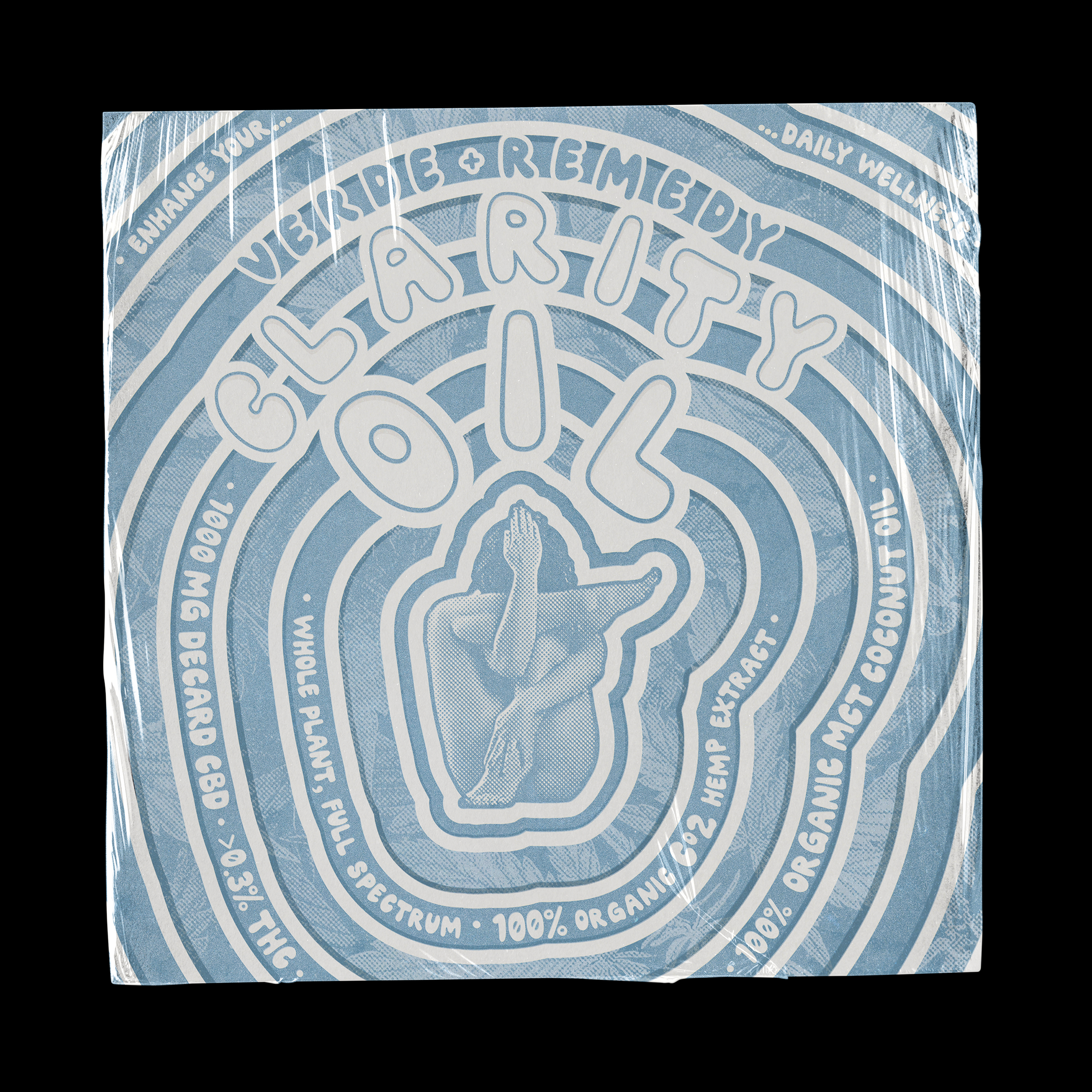
Clarity Oil sachet · maze type
01
Clarity Oil sachet · maze type
01 / 10

Solutions

  • Built the Verde + Remedy identity on hand-drawn maze and wavy-line typography, with each SKU dressed in its own concentric-pattern lockup (Clarity Oil in slate blue, Muscle Balm in sage green, Lip Balm in terracotta and seafoam)
  • Designed the product wrap system across oil sachets, balm tins, lip-balm wraps, and tincture cartons so the line photographs as a family on the shelf
  • Delivered editorial pamphlets and bifold collateral (Can Hemp Oil Help Treat Endometriosis, Women and Hemp Oil, Hormonal Balance) carrying the same hand-drawn voice into long-form education

Results · in numbers

Multi-asset
Cross-format brand deliverables shipped
1
Unified visual system across the engagement
B2C
Customer-facing brand surfaces
Brand-led
Identity work inside client guidelines

Brand system

Palette
/01
Slate Sky Blue
/02
Sage Green
/03
Apothecary Terracotta
/04
Hemp Cream
/05
Editorial Ink
/06
Newsprint