htm@portfolio:~$ cat swich
01 / 19
S'WICH
S'WICH
A hospitality brand that needed to live on a Coles shelf AND feel like a corner-shop favourite at the same time.
Jump to artboardsChallenge
S'WICH began with a basic logo, a colour palette, and a wordmark. The job was to make all of it hold together across menus, packaging, and the digital surface, while keeping the brand alive in a saturated café market.
Artboards · selected work
S'WICH01 / 16

01
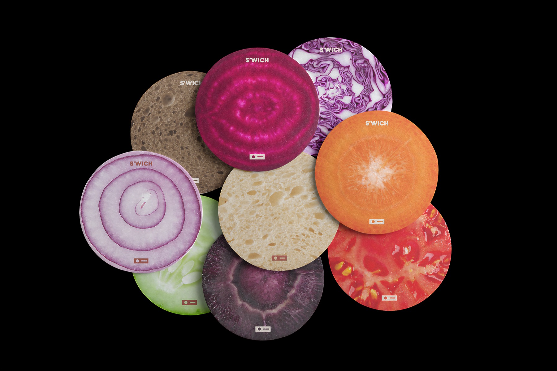
Produce coasters · launch hero
01 / 16
Deliverables · index
Nate became instrumental not just in shaping our design but in guiding our overall strategy. Every element has been carefully thought through and elevated under his direction.